Cards
Basic Card
Basic Card
A Basic Card contains a title field and a body field with a WYSIWYG editor--basically the swiss army knife of content display options. When creating or editing this card there are options to style copy, link content, add media and insert accordions, just to name a few. You can also change the card color, alignment, and border. Learn more about the WYSIWYG editor by watching the tutorial videos.

Map Card
Map Card
A Map Card contains the view of a specified map. When creating a Map Card, the necessary information is only the location. A title, title color, and background color for the card can also be specified.


Tabs Card
Tabs Card
The Tabs Card allows for the creation of tabs of content within a row. These tabs can be populated with WYSIWYG body sections as well as customized with background colors. The only required piece of information for this card is the Tab Title.
Lorem ipsum dolor sit amet, consectetur adipiscing elit, sed do eiusmod tempor incididunt ut labore et dolore magna aliqua. Viverra mauris in aliquam sem fringilla ut morbi. Tincidunt arcu non sodales neque sodales ut. Fames ac turpis egestas sed. Cursus risus at ultrices mi tempus imperdiet nulla malesuada pellentesque. Auctor eu augue ut lectus. Suscipit adipiscing bibendum est ultricies integer quis. Consectetur adipiscing elit ut aliquam purus sit amet. Arcu dictum varius duis at consectetur lorem. Proin sed libero enim sed faucibus turpis. Imperdiet dui accumsan sit amet nulla facilisi morbi tempus iaculis.
Lorem ipsum dolor sit amet, consectetur adipiscing elit, sed do eiusmod tempor incididunt ut labore et dolore magna aliqua. Viverra mauris in aliquam sem fringilla ut morbi. Tincidunt arcu non sodales neque sodales ut. Fames ac turpis egestas sed. Cursus risus at ultrices mi tempus imperdiet nulla malesuada pellentesque. Auctor eu augue ut lectus. Suscipit adipiscing bibendum est ultricies integer quis. Consectetur adipiscing elit ut aliquam purus sit amet. Arcu dictum varius duis at consectetur lorem. Proin sed libero enim sed faucibus turpis. Imperdiet dui accumsan sit amet nulla facilisi morbi tempus iaculis.
Block Card
Block Card
Block Cards show any custom blocks that were created (row or basic). Custom block creation will be discussed in section 21. Once a custom block is created and named, its name will appear in the list of possible custom blocks to add in this Card.
View Card
View Card
A View Card allows you to display specific types of published content in a pre-defined, dynamic way. Some examples include the ability to display a title and a short description of a collection of events (in a mini calendar month or week, or in an upcoming events view), news articles, blog posts, and press releases. When a View Card is placed, the kind of collection is specified in the View box and the Display ID is also specified.
- Recent Articles: There are three types of articles--News, Blog, and Press Release--that can be set using this option.
- Article Chain: Another recent articles view including an optional image to the left, which is pulled from the Featured Image added to each article page. This view can be set to include four or eight articles in a feed.
- Event Chain: Another upcoming events view including an optional image to the left, which is pulled from the Featured Image added to each article page. This view can be set to include four or eight articles in a feed.
- Mini Calendar - Month: The mini calendar has a monthly option to quickly display all events in a single month for users.
- Upcoming Events: The upcoming events view shows the next three (3) future events that are published, according to the date/time added in the editor.
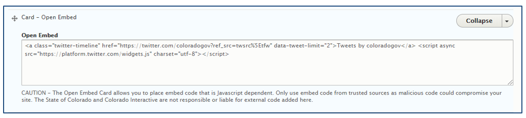
Open Embed Card
Open Embed Card
An Open Embed Card allows secure, third-party sites/applications code on a page. This embed code could enable a Twitter feed to display (as shown), YouTube videos, Google Drive folders, Tableau visualizations, and more--as long as the source provides the appropriate iframe HTML i.e., embed code. This card essentially allows content authors to add third-party source code within the native colorado.gov website page.
Icon Card
Icon Card
Icon Cards are blocks of space that are reactive and link. The features of an Icon Card include icon text, icon position, icon, link URL, link text and color.
Media Card
Media Card
Media Cards are cards that just contain an image. Files can be uploaded to the media card from the media library. A link can be added to media cards to make them clickable. A caption can also be added. Media cards cannot be sized individually and are scalable based on the content added around them.

Webform Card
A webform card allows you to add a webform to the layout of your page rather than having the webform be its own page. You can still create a webform as its own page. Create the webform in the Structure > Webform section and then add it to your row using the webform card.