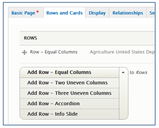
Rows
Rows are the way that content is organized horizontally on a page. To organize content vertically, use multiple Rows. Rows can be customized by changing their titles, color, and widths. Additionally, there are multiple choices for kind of Row. Once a Row has been selected, Cards are added, some of which can be edited with the WYSIWYG.
Hero Rows:
Note that Hero Rows have the same functionality as other rows, however there is the option to add a background image similar to the Jumbotron. Hero Rows only appear on Landing Pages.
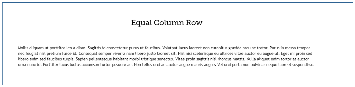
Equal Column Row
The default row format has equal columns. In this row, all cards are given the same width. If you only place one Card into the Row, then that Card will be the entire width of the Row. If two Cards are placed, each will be half the width, and so forth. It is recommended that no more than six Cards are placed per Row.
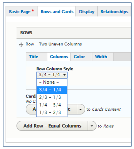
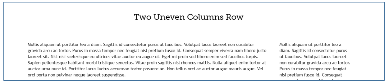
Two Uneven Columns
The Row selection for two uneven columns also allows for the active User to customize the width of those columns.
The width choices include:  and
and  ,
,  and
and  , and , and and
  . Shown to the right is the default and width selection.
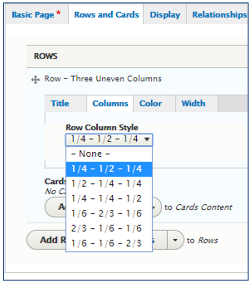
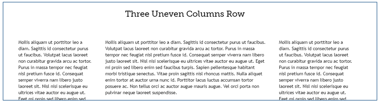
Three Uneven Columns
The Row selection for three uneven columns also allows for the active User to customize the width of those columns.
The width choices include: and  and , and and , and and ,
  and and , and and , and and and . Shown to the right is the default and and width selection.
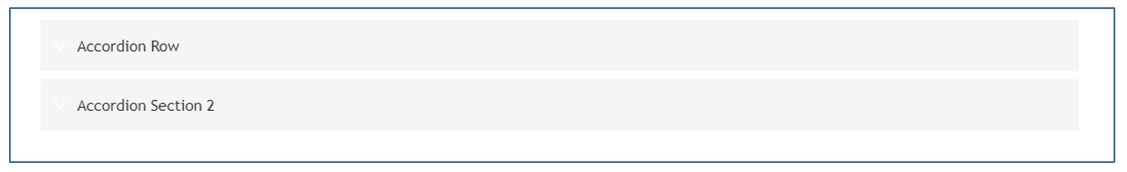
Accordion Row
The row selection of Accordion allows the webpage content to be minimized into containers that can be clicked to open a view of additional content without switching pages.
Info Slider
An Info Slider allows for multiple rows to be automatically cycled through across the screen. The Info Slider can hold multiple rows in it, and within those rows, multiple cards. This Row allows for content to be vertically compressed and then cycled through horizontally.